Example: Grouped Column Chart (Farm Data)
This program is an example of creating a grouped column chart:
##############################################################################
#
# An example of creating a chart with Pandas and XlsxWriter.
#
# Copyright 2013, John McNamara, jmcnamara@cpan.org
#
import pandas as pd
from vincent.colors import brews
# Some sample data to plot.
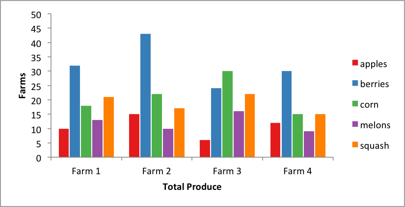
farm_1 = {'apples': 10, 'berries': 32, 'squash': 21, 'melons': 13, 'corn': 18}
farm_2 = {'apples': 15, 'berries': 43, 'squash': 17, 'melons': 10, 'corn': 22}
farm_3 = {'apples': 6, 'berries': 24, 'squash': 22, 'melons': 16, 'corn': 30}
farm_4 = {'apples': 12, 'berries': 30, 'squash': 15, 'melons': 9, 'corn': 15}
data = [farm_1, farm_2, farm_3, farm_4]
index = ['Farm 1', 'Farm 2', 'Farm 3', 'Farm 4']
# Create a Pandas dataframe from the data.
df = pd.DataFrame(data, index=index)
# Create a Pandas Excel writer using XlsxWriter as the engine.
excel_file = 'grouped_column_farms.xlsx'
sheet_name = 'Sheet1'
writer = pd.ExcelWriter(excel_file, engine='xlsxwriter')
df.to_excel(writer, sheet_name=sheet_name)
# Access the XlsxWriter workbook and worksheet objects from the dataframe.
workbook = writer.book
worksheet = writer.sheets[sheet_name]
# Create a chart object.
chart = workbook.add_chart({'type': 'column'})
# Configure the series of the chart from the dataframe data.
for col_num in range(1, len(farm_1) + 1):
chart.add_series({
'name': ['Sheet1', 0, col_num],
'categories': ['Sheet1', 1, 0, 4, 0],
'values': ['Sheet1', 1, col_num, 4, col_num],
'fill': {'color': brews['Set1'][col_num - 1]},
'overlap':-10,
})
# Configure the chart axes.
chart.set_x_axis({'name': 'Total Produce'})
chart.set_y_axis({'name': 'Farms', 'major_gridlines': {'visible': False}})
# Insert the chart into the worksheet.
worksheet.insert_chart('H2', chart)
# Close the Pandas Excel writer and output the Excel file.
writer.save()